
Every so often one comes across a chart where you look at it and the implications seem obvious. Westpac recently published its Westpac Melbourne Institute Consumer Sentiment Unemployment expectations chart pack for February and YieldReport and overlaid it against a chart of the RBA cash rate.
One part of the Westpac-MI survey relates to unemployment expectations (see below chart, red line). As people in the survey thinks their chances of being unemployed fall (the red line becomes more negative; the axis is inverted) and they are more confident of keeping their jobs, the RBA is more likely to raise the official rate (see below chart, black line). The valuable aspect of this sort of chart is the unemployment expectations line (as opposed to the actual unemployment rate) would appear to be a leading indicator of the RBA’s actions.
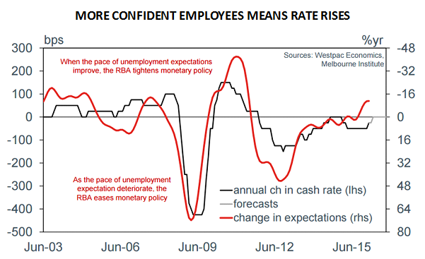
Currently, opinion among economists at the major banks and other financial institutions is divided when it comes to the next RBA move but many are expecting the RBA’s to cut rates. Cash markets are pricing 2016 and 2017 interest rate contracts with at least one rate cut built in. Even Westpac, the co-owner of the consumer sentiment survey, thinks the official rate will stay steady all through 2016 and into 2017.
Despite markets pricing in one rate cut as a certainty and even a small chance of a second rate cut, the unemployment expectations survey would seem to indicate the next move from the RBA is likely to be an increase in the cash rate.