
Summary: See chart below. Tells you all you need to know – expectations of cuts declining. Not great for your bond portfolio. Neither are razor thin spreads – risks to the upside, I what we’d say.
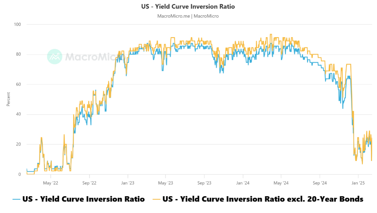
Regarding this chart, the yield curve inversion ratio is calculated by looking at the proportion of inverted yields in the US Treasuries across different maturities, including 30-year bonds, 20-year bonds, 10-year bonds, 7-year bonds, 5-year bonds, 3-year bonds, 2-year bonds, 1-year bonds, 6-month bonds, 3-month bonds, and 1-month bonds. The yield curve inversion ratio indicates the proportion of inverted yields in the 55 combinations of maturities.
Long-term yields often represent inflation, while short-term yields represent interest rates. The difference between the two could be indicative of economic growth. Higher proportion of inverted yields suggest higher likelihood of an economic decline.
To find out more about the yield curve and its usefulness, click here or here.