
Summary:
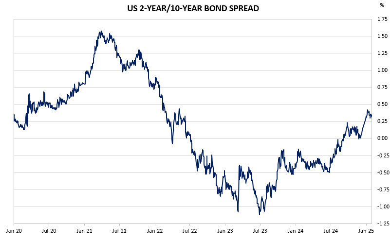
The charts below depict an inverted yield curve. That is, the market is expecting a ‘high for longer’ market scenario in both Australia and the US.
Exhibit 1: Australian 3Y/10Y Spread
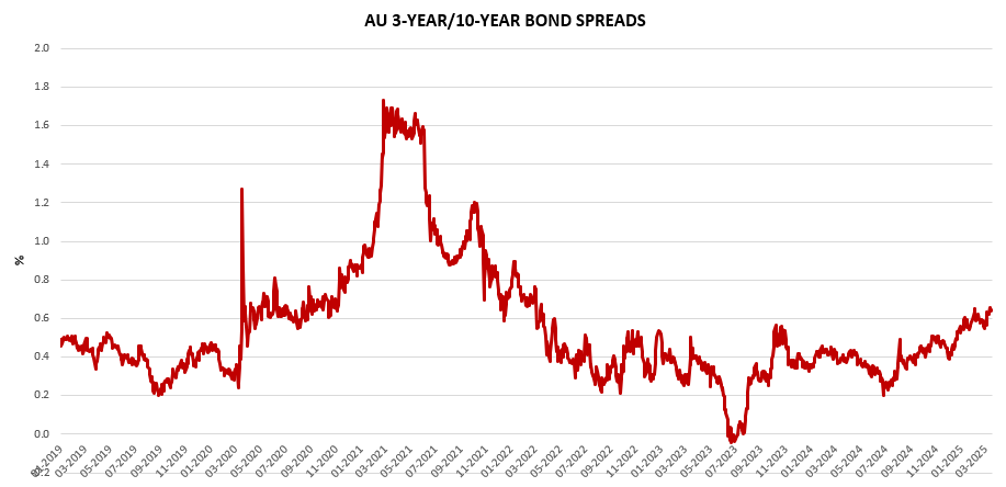
Exhibit 2: US 2Y/10Y Spread
To find out more about the yield curve and its usefulness, click here or here.