
Summary:
The chart titled “Australian 3 & 10-Year Bond Yields & Spreads” illustrates the movement of Australian government bond yields for 3-year (red line) and 10-year (blue line) maturities, along with the yield spread (grey bars) from early 2019 to late 2025.
Key Observations:
- Pre-2021 Decline: Both 3-year and 10-year yields trended downward from 2019 through mid-2020, reflecting accommodative monetary policy and pandemic-related economic conditions. The 3-year yield fell below 0.5%, while the 10-year yield hovered near 1%.
- 2021 Stability: Yields remained relatively flat during 2021, with spreads narrowing significantly, indicating a compressed yield curve.
- 2022 Surge: A sharp upward movement occurred in early 2022 as inflationary pressures and rate hikes drove yields higher. The 10-year yield peaked above 4%, while the 3-year yield climbed past 3%.
- Post-2023 Plateau: From mid-2023 onward, yields stabilized at elevated levels, with the 10-year yield consistently above the 3-year yield, maintaining a positive spread. Spreads fluctuated between 0.8% and 1.6%, suggesting moderate steepness in the curve.
- Current Trend (2025): Both yields remain elevated compared to pre-pandemic levels, signaling persistent tight monetary conditions and long-term inflation expectations.
Implications:
The widening spread during 2022–2023 reflects market anticipation of sustained economic growth and inflation, while the recent stability suggests normalization but at higher interest rate levels.
Figure 1: Australia 3 and 10-year Bond Yield Spread
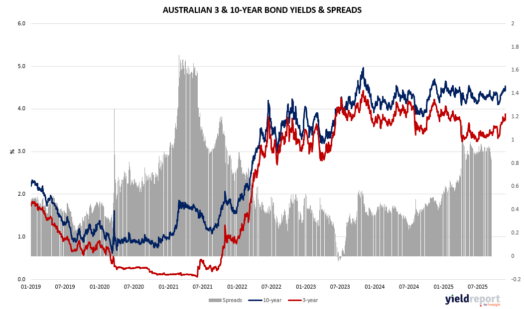
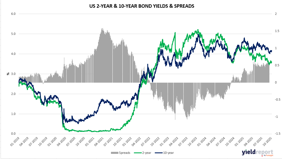
Figure 2: US 2 and 10-year Bond Spread
To learn more about yield curves and their predictive power, visit this article or this one.