
Summary:
The US term premium eased slightly on Thursday and Friday with the backup in the 2-year as the market reset Fed cuts, and particularly on Friday on the jobs report. Nevertheless, the term premium remains elevated based on a combination of longer term fiscal concerns and policy uncertainty. Essentially, bond managers are requiring higher yields on longer maturities, with the term premium at its highest since 2014, and are becoming more cautious in their investments, favouring shorter maturities and limiting their exposure to longer-term bonds. In the new world order, call it the Fear of the Long Bond. And we can’t see that changing over the foreseeable future, and partly because the demand is increasingly moving to the front and circa 5-year part of the curve. In fact, the yield curve will likely steepen from here. If it does, obviously long-end yields will start to become more attractive.
Beyond last week and more broadly, rates on the long-end of the yield curve have risen steadily since the April 2nd tariff announcement, with 30-year nominal rates climbing 27bps and real 30-year rates popping 36bps. The dramatic move in the long-end of the curve has seen 10-year term premium push up to 10-year highs. Some of the move may be attributable to positioning and other temporary factors – the notable plunge in prime brokerage leverage data and the sharp move towards even more deeply negative swap spreads are consistent with the unwind of levered curve bets by hedge funds and other speculative actors. However, there are reasons to believe that long rates may continue to be volatile or even move higher, including a continued deterioration in the fiscal outlook, as noted above.
While the unwind of leveraged curve trades has sparked a sell-off on the long-end and a steepening of the yield curve, the front-end of the curve (0 to 5 years) has stayed elevated and relatively flat. Many fixed income managers believe that income and carry look attractive on the front end of the Treasury curve as well as in select corporate credits is the more attractive part of the curve.
-

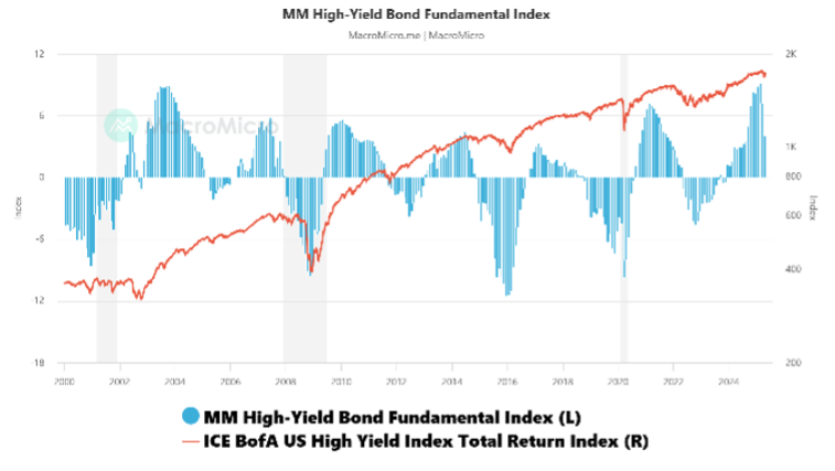
- Figure 1: US High Yield Bond Fundamental Index
-
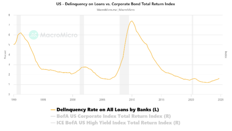
- Figure 2: Delinquency on US Loans
In relation to Figure 1, the MM Fundamental Index for high-yield bonds is an integral index for assessing the fundamentals of junk bonds. When it goes up, the fundamentals of junk bonds are looking good. The Fundamental Index is updated with the monthly value on the last Friday of each month, and there may be subsequent changes due to data revisions for its constituent variables.
In relation to Figure 2, the US Fed surveys large commercial banks on the delinquency rates on loans and leases each quarter. As delinquency rates on loans and leases reflect the overall debt repayment capacity of businesses, delinquency rates serve as an important indicator of corporate bond defaults. The latest statistics are very solid: Delinquency Rate on All Loans by Banks (2024-Q4): 1.62%. Previous month: 1.52%.
-

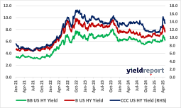
- Figure 3: US High Yield Bond Effective Yields
-
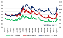
- Figure 4: US High Yield Bond OAS Spreads
|
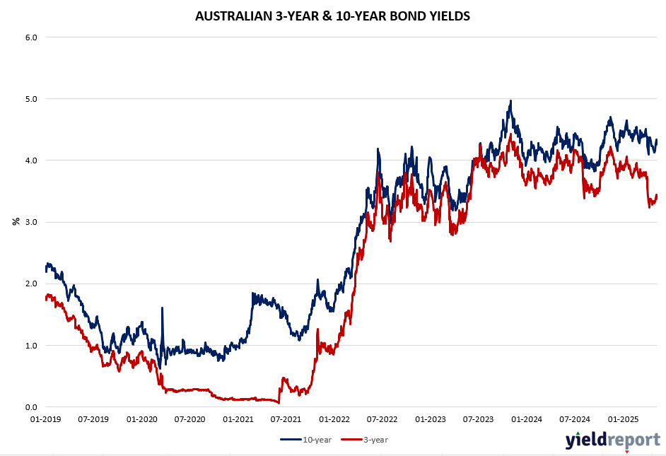
Exhibit 1: Australian 10-yr minus 3-year Spread |
|
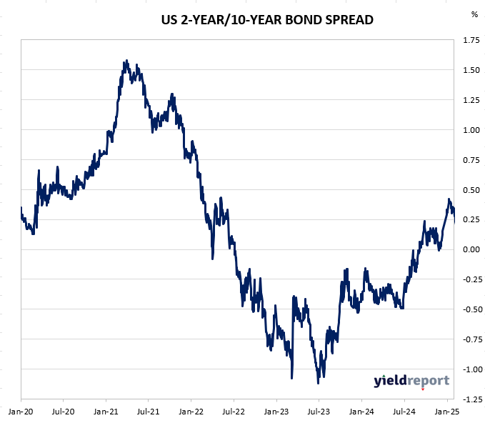
Exhibit 2 : US 10-yr minus US 2-yr Spread |
To find out more about the yield curve and its usefulness, click here or here.