
Summary:
Australian Yield Curve (3-Year vs 10-Year)
- Trend Overview:
From 2019 to early 2021, both 3-year and 10-year yields declined sharply, reflecting accommodative monetary policy and pandemic-related stimulus. The 3-year yield even approached near-zero levels during 2020–2021, consistent with the RBA’s yield curve control policy. - Post-2021 Shift:
Starting in late 2021, yields surged as inflation pressures mounted and the RBA began tightening policy. The 10-year yield peaked above 4% in mid-2023, while the 3-year yield climbed to around 3.5%, indicating aggressive rate hikes. - Current Position (2025):
Both yields have stabilized but remain elevated compared to pre-pandemic levels. The 10-year yield is around 4.2%, and the 3-year yield near 3.2%, suggesting markets expect rates to stay higher for longer. -
Spread Analysis:
The spread (10Y–3Y) narrowed significantly during 2022–2023, occasionally dipping below 0.5%, signaling flattening and potential recession concerns. Recently, the spread has widened slightly, pointing to normalization but still cautious sentiment.
Figure 1: Australia 3 and 10-year Bond Yield Spread
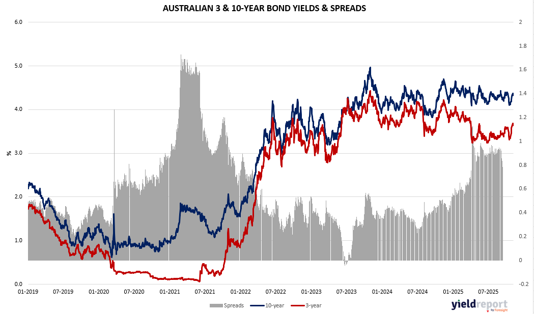
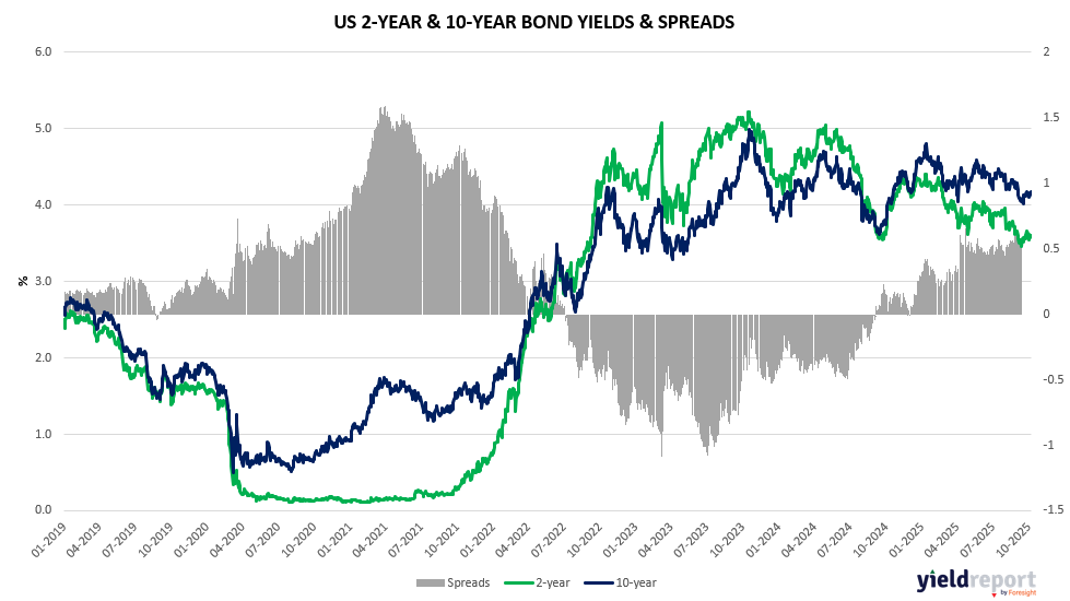
Figure 2: US 2 and 10-year Bond Spread
US Yield Curve (2-Year vs 10-Year)
- Trend Overview:
Similar to Australia, US yields fell sharply during 2020 as the Fed slashed rates. The 2-year yield hovered near zero until late 2021. - Aggressive Tightening Phase:
From 2022 onward, the Fed’s rapid rate hikes pushed the 2-year yield above 4.5% by mid-2023, briefly exceeding the 10-year yield and creating a deep inversion (spread below -1%), historically a strong recession signal. - Current Position (2025):
The inversion has eased but persists mildly, with the 10-year yield around 4.1% and the 2-year near 3.6%. This suggests markets anticipate eventual rate cuts but remain cautious about inflation risks. -
Spread Analysis:
The spread has moved from extreme inversion toward neutral territory, now hovering near 0.5%, indicating reduced recession fears but not full confidence in long-term growth.
To learn more about yield curves and their predictive power, visit this article or this one.